Responsive Web Design : Basic Fundamentals
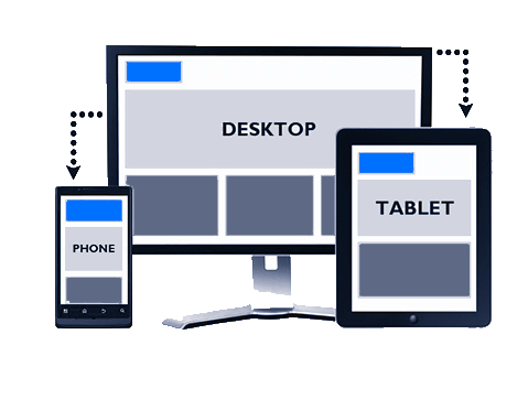
The technology is rapidly expanding day by day and with this, there is an expansion of many devices with many different functionalities and different screen sizes. Long gone are the days for the website designers, where they could just write a single piece of website design and forget about everything else, even if it is required. Responsive web designs are the perfect solutions to our multi-screen problems, but getting into it from the print perspective is very difficult. To design in respect to pixels for desktop and mobile is also the past, as more and more gadgets can open up the website. The responsive web design is the approach where a designer creates a web page that responds to or resizes itself depending on the type of device it is being seen through. The responsive designs have become an important tool for anyone with the digital presence. With an increase in smartphone, tablets and other mobile computing devices, more and more people are using smaller screens to view web pages.
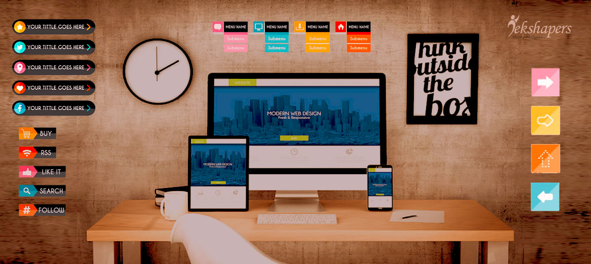
Responsive website
The main and core purpose of responsive web design is to have one site but with the help of different elements which responds differently when viewed on the devices having completely different sizes. In the field of web design and development, we are quickly getting to the point of being unable to keep up with the endless new resolutions and the devices. For many of the websites, to create a website version for each of the resolution and new devices can be quite impossible of losing visitors from one device for the benefit of gaining visitors from another. The web design is the approach which suggests that the website development system and design system must respond to the user’s behavior and environment based on the screen size, platform, and orientation. According to the reports, 22% of the users turned to their phone first for browsing the internet and looks at the website on it. With the help of responsive web design, all the content and pages are flexible across all screen resolution and devices.
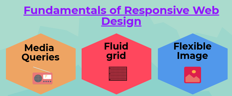
So today, we are going to look at the 3 basic fundamental techniques which you need to master, by which you can be an effective responsive designer:
-
Media Queries
The media queries let you design the website in different layouts for each different media types like a screen print, TV, handheld devices, etc. Depending upon the media types, you can configure the style, font and another required element of the page. The range of media type includes handheld, screen, TV, print, and projection. They generally consist of a media type declaration and one or more media feature expression which evaluates to a true or false statement.
-
Fluid Grids
The fluid grid is the term which is used for describing the layout that is cooled in the relative proportion of the various elements rather than with fixed pixel values. The traditional CSS layouts are used with fixed grids to position the elements. The fixed grid approach no longer works today, because now we have the device screens which range from 3 inches to a few feet.
-
Flexible Image
The images are deemed flexible when the image renders in the native size as long as the HTML container supports it, but when the browser window shrinks, then the image scales to fit into it. If the browser window or screen becomes the smaller, this piece of CSS code will shrink the image proportionately and the height of the image is adjusted automatically while keeping the aspect ratio locked.
Why Do Businesses need to switch to Responsive Web Design?
The no. of people using mobile devices is increasing daily and so is the scope of businesses to reach towards customer especially through their sites is increasing. A recent study of Pew research has demonstrated that 77% of the Americans now own the smartphones in the year 2018 which is increasing 35% from 2011. In order to capitalize on the optimum usage of infographics and other features, the organization firms are increasingly incorporating the responsiveness nowadays. You might be unsure as to whether or not the businesses website must be implemented as responsive design, especially if you do not understand the concept. The responsive design can help you to solve lots of issues for your website. It will make your website mobile friendly and thus improves the way in which it looks on the devices with both large and small screens and thus increases the amount of time which visitors spend on your site.
Need of Responsive Website for Business
The responsive design also helps to improve your ranking on search engine. Additionally, according to the reports, Google announced that mobile friendliness would become a ranking factor in its search engine algorithms. With the mobile development services and technology operating on a continual cycle of development and mobile usage still regularly growing and there really isn't a question anymore. The top website development companies all around the globe, like Tekshapers one of the pioneer and well-recognized website development service provider takes care of the client’s business website as their own and makes it user-friendly and easy for deployment. This will help to reduce the amount of the clients business which can be found through browsing but also can make it more difficult for existing customers when they require connecting with you through their mobile platform.
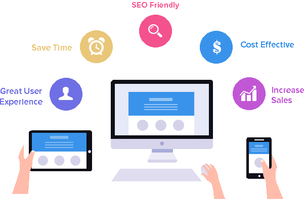
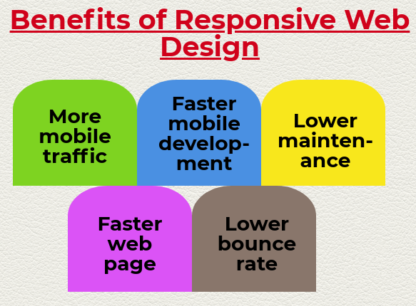
Benefits of Responsive Web Design
The responsive web design benefits designers, developers, and business and most importantly to the users in the following number of ways:
-
More Mobile traffic
According to the report from the similar web, about more than half of the traffic to top websites in the U.S. comes from mobile devices, in the year 2015. Therefore, it is increasingly crucial for the organization to have a website which renders properly on a smaller screen so that the users cannot encounter the distorted images or experience a sub-optimal site layout.
-
Faster Mobile development
Making one the responsive website takes considerably less time than making a stand-alone mobile application in addition to the standard desktop website. Since we know, time is money; therefore, the response design naturally comes as lesser cost alternative.
-
Lower Maintenance
Maintaining a separate mobile site requires additional testing and support. In contrast, the process of responsive design uses the standardized testing methodologies for ensuring the optimal layout on every screen. By having separate desktop and mobile sites also need two content strategies, two administrative interface and potentially two design teams.
-
Faster Web pages
The mobile users, in particular, have short attention spans. According to the studies the mobile visitors tend to abandon the webpage which take longer time than three seconds to finish the loading. By ensuring that your web design uses modern performance techniques will help to improve your webpage loading speed.
-
Lower Bounce rate
A responsive and optimized mobile site provides the much better user experience for the visitor. Therefore, it is much more likely that they will stick around for a longer period of time and thus can explore the different areas of your site. Alternatively, if your site is not responsive then it is harder to keep the visitors engaged to your site.
Conclusion
The responsive design is the future of our industry, but because of so many different techniques flying around, it is often hard to keep up. This is the mere concept which when implemented correctly can help to improve the user experience, but not completely solve it for every user. To continually improve the user experience as technology evolves in coming years, we need to constantly work on with new devices.
Recent Blog

Why Your Business Needs a Mobile App?
06-Dec-2022


Related Blogs
20-Feb-2018

20-Apr-2018
A secret of Mobile Application Development
23-Apr-2018


Market Demand for CRM and ERP Development
07-May-2018


